Visibility hidden vs display none – What is the difference in CSS ?

CSS

visibility hidden vs display noneWith visibility:hidden, the element still takes up space. With display:none, it is effectively removed from the DOM.

Hiding DOM elements with CSS is a common task. Some wonder whether they should use visibility:hidden or display:none. So, let’s think about Visibility hidden vs display none. Before you decide, the question to ask yourself is: “do I want the element to still have a physical effect on the DOM? or do I want the element to feel as if it has been removed from the page?”. This is an important question. The difference between visibility:hidden and display:none in CSS is how the hidden element affects the DOM.

Continue reading “Visibility hidden vs display none – What is the difference in CSS ?”

How do I use the jQuery.css() Method?

jQuery

Angular logo - cssThe jQuery CSS method allows you to style one or more DOM elements

Let’s begin with the HTMLElement.style property, which provides the access you need to style any DOM element. As a front-end web developer, you should make it a point to be familiar with this low-level DOM API. But the HTMLElement.style property comes with challenges, the two biggest being:

  1. The syntax is verbose, which leads to repetitive, boilerplate code.
  2. You cannot overwrite the HTMLElement.style property, which means that you cannot arbitrarily assign an object to it.

Now while it may seem like a minor detail that you cannot overwrite the HTMLElement.style property, this limitation does negate the ability to assign a well-crafted object to an HTMLElement’s style property. It also severely minimizes code re-use.

But the jQuery CSS method provides a powerful way to sidestep the quirky limitations of the HTMLElement.style property. It offers the ability to style DOM elements in a way that is considerably more elegant and expressive.

For one thing, the syntax is based on method chaining; you chain the css() method to the result of any jQuery query. So whether your query returns one or many elements, the style property and value that you pass to the css() method will be applied to the element(s) returned by your query. And in addition to a more concise syntax, there is the potential for code reuse. And finally, something that is often overlooked about this method: you are styling the DOM element directly (as opposed to using an external style sheet). As a result, the styles you apply will enjoy a high specificity.

In its most basic form, the jQuery.css() method takes two arguments. Both arguments are strings. The first argument is the name of the CSS property that you want to change. The second property is the new value for that CSS property. When you execute the CSS method against one or more DOM elements, jQuery adds a style attribute to each DOM element. And then, jQuery uses the second argument you provided as the value for that CSS property.

Try it yourself !

In the above example, there are five paragraph elements. Click each paragraph. When you do, you’ll see that each clicked element turns red. Click the JavaScript tab. In the JavaScript code, you’ll see that there is a click-event handler set up for each paragraph element. As a result, when any paragraph is clicked, jQuery executes the CSS method against that paragraph. Two arguments are passed to the CSS method. The first argument is color, which is the CSS property that we want to change. The second argument is red, which is the new value for that CSS property.

So, the approach taken so far is a very simple implementation of the css() method. In this case, we are passing only two strings. These two strings act as key/value pairs for the specified style property. But it is also possible to pass an object to the css() method. Significantly, this approach allows you to style multiple properties of an HTMLElement. This, of course, is an advanced implementation of the css() method, which I’ll cover in another article; for now, it’s just good to be aware of it.

Summary

So once you’ve had a chance to work with the css() method a little, I think you’ll agree that it is arguably one of the most genius features of jQuery. It frees you from two limitations of the HTMLElement.style property, and in addition to the elegant syntax, this method provides a way to re-use well-crafted code, in order to style multiple DOM elements. And if you look into the advanced syntax, you’ll see that multiple styles can also be applied within one call to the css() method.

CSS Fixed Position

Position

jquery-logo With CSS fixed position, the element is completely removed from the document flow, but positioned absolutely in relation to the view-port. You can then use the “top”, “bottom”, “left” and “right” properties to specify the exact location in which you want it.

Sometimes you may need to place an element in an exact position. That is, you don’t want to be tied to the natural document flow. Following the natural document flow is often the best way to go, and it is important to keep that in mind. But when you want to take an element out of the document flow and set it at an exact location in relation to the view port, position fixed is the tool for the job.

Fixed position is often confused with absolute position, but while their behavior is somewhat similar, they are not exactly the same thing. It’s important to note here, that with absolute position, the relationship between the HTML element and its descendants matters. For a detailed discussion on absolute position, CLICK HERE.

With fixed position, there is no concern about the relationship between the HTML element and its descendants. The HTML element that you apply to fixed position is completely removed from the document flow and placed relative to the viewport. That is, this element cares only about where the viewport is. It is as if its descendants simply do not exist; it does not know about them or care about them. And once you’ve set the position to fixed, you can use the “top”, “right”, “bottom” or “left” properties to further refine the visual location of the fixed position element. In other words, these top, right, bottom and left properties allow you to specify how the fixed position element is offset from the viewport.


Example # 1

See the Pen CSS Fixed Absolute Demo | Front End Video by Front End Video (@frontendvideo) on CodePen.

In Example # 1, the element with the class “child” has its CSS position property set to “fixed“. As a result, the element is completely removed from the document flow and positioned absolutely in relation to the view-port. Since there is quite a bit of text in the page, you must scroll in order to see all of it. Notice that as you scroll, the .child element stays put and does not move with the scroll. The reason that the .child element appears at the top is because its top property is set to 0. This is one of the most popular uses for  position:fixed; that is, creating a page header that does not move when you scroll.

Example # 2

See the Pen CSS Position Fixed Demo | Front End Video by Front End Video (@frontendvideo) on CodePen.

Example # 2 is mostly identical to Example # 1. The only difference is that the .child element’s top:0 property has been changed to: bottom: 0. As a result, the element is fixed to the bottom of the view-port. Notice how when you scroll, the .child element does not move away from the bottom. This is usually the technique used when you see a custom footer that stays set to the bottom of the page and does not move.

Summary

So, with fixed position, an HTML element is completely removed from the document flow. There is no concern about the descendants of that element because it is positioned relative to the viewport. Then the “top”, “right”, “bottom” and “left” properties can be used to “nudge” the element further, which means that you can determine how the element is “fixed” to the viewport and where it should appear.

CSS Relative Position

Position

jquery-logo With CSS relative position, the element still affects the document flow, but it can be offset, or “nudged” around from its original location. The element will appear to have been moved visually, but its effect on the DOM remains the same.

Changing the visual location of an HTML element is a common front-end web development task. The challenge is in choosing which tool should be used to accomplish this task. By “tool”, I mean which CSS property best suits the outcome you hope to have? Now, while the position property is quite often the go-to tool for this task, sometimes it can be confusing as to which CSS position property to apply. For example, absolute is similar to fixed.
But then again, absolute is sometimes confused with relative because of the ability to apply “top”, “right”, “bottom” and “left” properties to your rule set.

Just keep in mind that the confusion that surrounds absolute and relative position is mostly related to document flow. With absolute position, you are removing the element from the document flow, which is neither good nor bad; it’s just a big feature of absolute position. So, if you feel that absolute position is the tool you need, look HERE.

If you want to change the visual location of an element, yet keep it in the document flow, then CSS relative position is what you need. The element will still have the exact same physical effect on the DOM. That is to say: the other elements around it still think it is exactly where they expect it to be. But, from a purely visual standpoint, the element can be moved.

Example # 1

See the Pen CSS Relative Position Basics | Front End Video by Front End Video (@frontendvideo) on CodePen.

In Example # 1, we have three nested elements with the following classes applied: “child“, “parent” and “grand-parent“. From now on, let’s use those class names to refer to the elements. Each element has a specific CSS background-color property set, so that it is easier to identify.

The child element has its CSS position property set to:  “relative“. It also has its CSS top and left properties set to 100px and 50px. This tells the browser: “offset this element 100px from the top and 50px from the left of where it should normally be in document flow. As a result, the child element appears pushed down 100px and pushed right 50px.

Example # 2

See the Pen CSS Relative Position – Intermediate 2 | Front End Video by Front End Video (@frontendvideo) on CodePen.

In Example # 2, we’ve added five black boxes that are siblings of the child element. They do not have position relative set, so they appear exactly where we expect them to be in the document flow. Let’s call each of these five black boxes child.black.

Notice that although our child.green box appears pushed down and pushed right, the child.black boxes are not pushed down. It may seem as though they should, since the child.green box should push them down. This is because using position relative to “nudge” an element around only has a visual effect on the DOM; it does not affect the document flow. So, all of the child.black boxes still feel as if the child.green box is exactly where they expect it to be in the DOM. The “nudging around” aspect of using position relative is purely visual.

Example # 3

See the Pen CSS Relative Position – Intermediate | Front End Video by Front End Video (@frontendvideo) on CodePen.

In Example # 3, we have added position: relative to the fourth child.black box by using the CSS nth-child selector: .child.black:nth-child(4). This box is white, with a purple border. We have set it to be offset 10px from the top and 80px from the left of where it should normally be in the document flow. Just as is the case with child.green, the “nudging” is purely visual; the two child.black boxes below are not affected by this and appear as if this white box with the purple border is still were it should be in the DOM.

What is the difference between general sibling and adjacent sibling combinators in CSS?

Combinators

css-logo When making the differentiation between general sibling and adjacent sibling combinators, ask yourself if you want to target every sibling of the target element, or just the very next one.

In CSS, HTML element relationships play an important role in targeting. It’s true that you can use IDs, which means that your CSS selector can potentially be very simple. In most cases, however, IDs are not recommended. So, if you want to write CSS that is expressive and reusable, the relationship between HTML elements starts to matter.

Consequently, the concept of sibling relationships is an important one in CSS. In fact, other than parent-child relationships, the concept of siblings is possibly the one that you will need to consider most. So, with that in mind, let’s begin with the concept that there is more than one kind of sibling. And because HTML elements have order in the markup, you’ll have to decide whether you want to target ALL siblings of an element, or just the very NEXT one. The difference between these two scenarios is: when targeting ALL siblings of an element, you will be styling only one or many HTML elements. But when targeting the adjacent sibling of an element, you are styling one element. This is the difference between general sibling and adjacent sibling combinators in CSS: it’s a question of targeting one sibling or multiple siblings.

Let’s say you have 10 elements, and they all have black text. If you wanted to make every sibling of the element red text, then there would be nine elements with red text. If you wanted to just target the very next sibling after the first element, then you would have just one element with red text. That is, when you target just the very next sibling, you are targeting only one element.

Example # 1 – General Sibling Combinators

See the Pen CSS General Sibling Combinator by Front End Video (@frontendvideo) on CodePen.

In Example # 1, we have an unordered list of days. We use the general sibling combinator, which targets every sibling of: li:first-child.

Example # 2 – Adjacent Sibling Combinators

See the Pen CSS Adjacent Sibling Combinator by Front End Video (@frontendvideo) on CodePen.

In Example # 2, we use the adjacent sibling combinator. This targets only the very next sibling of li:first-child. As a result, only one of the list items has a blue background.

This is a case in which you are styling multiple HTML elements. Keep in mind that there could be only one general sibling combinator. For example, there could be two siblings total, but you target all general siblings of the first sibling. In that case, there is only one general sibling.  But if there was a total of 10 siblings, and you targeted all general siblings of the first sibling, then you would wind up styling nine HTML elements. In Example # 1, there is a total of seven siblings, so you wind up styling six HTML elements. And if you targeted all general siblings of the second sibling, then you’d wind up styling five HTML elements.

This is a case in which you are styling a single HTML element, and here, there can only be one adjacent sibling of any element. A similar concept would be an array element, in which there can only be one element that is right AFTER a given array element. Likewise, with HTML elements, there can only be one adjacent sibling. Therefore, the adjacent sibling combinator will always style exactly one element.

But it is important to keep in mind that when you use the adjacent sibling combinator, you could wind up styling multiple elements. Let’s say, for example, that you target the adjacent sibling of the first list item in an unordered list. That would result in styling one HTML element. But if you have two unordered lists, the net effect would be that TWO HTML elements are styled. This is because your selector applied to TWO places in your page. In other words, there are TWO places in your HTML code where your selector makes sense. So, while we say that the adjacent sibling combinator results in targeting one HTML element, that effect could take place multiple times in your web page.

Summary

Keep in mind that relationships matter in CSS selectors. For example, while the parent-child relationship is a common one, sibling relationships are as well. General sibling and adjacent sibling combinators both provide a powerful mechanism for targeting HTML elements, and the difference between these sibling combinators is how many HTML elements will be affected. With the general sibling combinator, one or potentially multiple elements will be styled. With the adjacent sibling combinator, only one element will be styled. But, don’t forget, the net effect of your adjacent sibling combinator targeting could wind up affecting multiple HTML elements if your selector connects with multiple locations in your web page.

What is the difference between inline and block in CSS ?

CSS

css-logo A block-level HTML element will always create a new line after the closing tag, whereas an inline HTML element will not

Inline vs block is one of the most important factors when choosing which HTML element to use in your markup. Semantics matter as well, and this should always be considered. But the display behavior will have a direct impact on the visual aspect of your page. With a block-level element, there will always be a new line after the closing tag. So, no matter how you organize your HTML, block-level elements always create a new line. With an inline element, there is never a new line. Therefore, no matter how you organize your inline-elements in the markup, they will always appear side-by-side.

Okay, so every HTML element that has a visual presence is either inline or block, by default. For example, HTML elements such as “SPAN”, “IMG”, and “LABEL” are inherently inline. On the other hand, HTML elements such as “DIV”, “P”, and “UL” are block by default. This default behavior can be changed, however; i.e., inline elements can be set to display:block, and block-level elements can be set to display:inline. There’s no reason why you can’t apply this kind of reverse display logic; it’s perfectly valid. Just keep in mind, though, that there may be visual ramifications, but, of course, that’s up to you. It’s just important for you to know that if you want to, you can change the default visual behavior of inline and block-level elements.

Example # 1 – Default Behavior

See the Pen CSS Block vs Inline Part 1 by Front End Video (@frontendvideo) on CodePen.

In Example # 1, there are three spans and three divs. As expected the spans all line-up side-by-side. In other words, because they are inline elements, there is no new-line after each element. Whereas with the div elements, each one appears on a new line. This is the default behavior of inline and block elements.

Example # 2 – Changing Default Behavior

See the Pen CSS Block vs Inline Part 2 by Front End Video (@frontendvideo) on CodePen.

In Example # 2, we have reversed the behavior of the elements in the page. Even though the spans are inline elements, they now stack on top of each other. This is because in the CSS, we set display:block for the spans. As a result, they behave like block-level elements. Also, the divs now line-up side-by-side. This is because in the CSS, we set display:inline.

Summary

Now while it may seem like overkill to discuss reversing the default visual behavior of inline and block-level elements, it is not at all unusual, so it’s worth having given it a closer look. There may be semantic reasons, for example, as to why you choose a particular HTML element, but need to change its display behavior. A typical example is a NAV element; you might want to use an unordered list for your web page navigation, but you need the navigation links to line up side-by-side. In this case, you would need to change the default block-level display of the list items to inline. So, this is just one small example of why it’s always nice to know where you have a little wiggle room.

How do I use the Angular ngClass attribute?

Angular

Angular logo - ngClass

The Angular ngClass attribute allows you to programmatically determine if a CSS class will be applied to an HTML element.

We know that adding and removing CSS classes is a common JavaScript task. Quite often, it is the most efficient way to make style changes to one or more DOM elements. In fact, there is a great deal of power in this approach, with its ability to add or remove one CSS class that can cascade, causing dozens, hundreds or even thousands of child elements to change in appearance. But when leveraging Angular, there is no need to manually add or remove CSS classes to or from DOM elements; Angular just takes care of this, based on the state of your data. So, as you’ll see in the examples below, the most efficient way to go is to use the Angular ngClass attribute, which allows you to determine if a CSS class should be added to a DOM element, based on the result of a JavaScript expression.

Sometimes you may want to apply some CSS to an element, based on the value of some data. And sometimes you may want to apply other CSS when that data changes, or if it has a very specific value. With the ngClass attribute, Angular makes this kind of CSS logic arbitrary.

Example # 1

In Example # 1, we have our component. This code example is short, as there is only one thing to point out: the contentHighlighted property. This property is a boolean, so it will always be either true or false. We will pay attention to this value in our template.

Example # 2

In Example # 2, we have our Angular template. First, let’s take a look at the buttons. The first button sets the contentHighlighted property to true. It also has an ngIf attribute set so that when contentHighlighted is true, the button is destroyed. The second button functions in the exact opposite way: it sets the contentHighlighted property to false, and is destroyed if contentHighlighted is false. When you run the example code, you’ll notice that button’s toggle. That is to say: when you click one, it disappears (i.e. is destroyed) and then the other button appears (is created), and vice verse.

Next, look at the style element. There, we’ve defined a highlighted class. So, any element that has the highlighted class gets an outline and pastel yellow background.

Finally, we have the div with the ngClass attribute. Based on the syntax, we have declared that if the contentHighlighted property is true, then the highlighted class will be applied to this element. Conversely, if the contentHighlighted property is false, then the highlighted class will not be applied to this element. When you run the example code, you’ll see that as you toggle the buttons, the highlighted class is toggled on that element, and when it is applied, then that element gets the outline and pastel yellow background.

Video Example Code

If you want to download the example code, visit this Github page, and then follow the instructions: bit.ly/kcv-angular-ngClass

Sumary

The Angular Ngclass attribute allows you to programmatically apply one or more CSS classes to a DOM element. The CSS class is applied or removed, based on the result of a JavaScript expression, and any valid JavaScript expression can be used. This is much more efficient than manually applying or removing CSS classes. It just provides so much power when you’re trying to make small or large style changes to your component and its children.

How to Center in CSS

CSS

CSS3-logo

Centering in CSS is a giant pain in the neck. Depending on the scenario, there are multiple ways to go about it, but it’s never fun.

How to Center in CSS is a code generator that consolidates all the possible techniques and gives you the code you need for each situation. Well Done!

howtocenterincss.com

Getting to Know the JavaScript element.classList Object

Object-Oriented JavaScript

JavaScript LogoNative JavaScript provides a way to access and manipulate all of the CSS classes that are assigned to an HTML element.

The JavaScript element.classList object is an instance of the JavaScript DOMTokenList object. It exposes one property and a number of methods that allow you to work with CSS classes that are assigned to an HTML element.

While it has been supported for some time by all major browsers, Microsoft Internet Explorer has, unfortunately, ignored JavaScript’s element.classList object until very recently (what a big surprise). If you need to support IE9 and below (and of course you do), then all bets are off. Bummer. That said, this object is nonetheless a super-helpful feature that makes CSS class manipulation a snap.

But what about jQuery?

There is no doubt that the jQuery methods hasClass(), addClass(), removeClass() and toggleClass() are all fantastic, but there ain’t nothin’ goin’ on under the hood that you can’t do yourself. And what is under the hood is tedious stuff like this:

This kind of code will soon join the ranks of the eight-track cassette and pagers. While that is the current reality of cross-browser CSS class list manipulation, the fact is that native JavaScript is always evolving, and as soon as Internet Explorer 10 becomes the IE standard, the JavaScript element.classList object will be yet another native JS tool to tuck into your belt.

The length Property

Even though the element.classList object is not an array, it is “array-like” in that it has a “length” property, and each CSS class name is represented by a numerically indexed property whose value is the name of that class (a string). This is super-helpful if you want to enumerate the classes that are members of this object. You could certainly grab an individual member’s value using bracket-notation: element.classList[0], a “for” loop, or the item() method, which is discussed next.

The JsFiddle link below demonstrates the classList object’s length property. The class “bar” is toggled when you click the element specified. On each click, the classList object’s length property is shown. Since a class is toggled, that length value changes with each click, which helps to demonstrate the dynamic nature of this property. Keep in mind that like any JavaScript array, the length property’s value will always be one higher than the index of the last element.

Here is the JsFiddle.net link for the classList object’s “length” property : http://jsfiddle.net/BmFZc/

The item() Method

The item() method allows you to reference a specific class name in the collection of class names. When you pass an integer to this method, it returns a string representation of the class name that matches that index. So keep in mind that this collection is zero-based. In the first JsFiddle link below, we manually reference a number of classes in the class list, using the item() method. In the second JsFiddle link below, we use a “for” loop to accomplish the same task.

Here is the JsFiddle.net link for the item() method: http://jsfiddle.net/N88x9/

Here is a second JsFiddle.net link for the item() method: http://jsfiddle.net/WE7gc/

The add() method

As you might expect, the add() method adds a class to the element’s class list. In the JsFiddle link below, you can see that the class “bar” is added to the element’s class list because the element’s appearance changes dramatically, as per the CSS that is specified.

Here is the JsFiddle.net link for the add() method: http://jsfiddle.net/uzMAx/

The remove() Method

In the manner opposite to the add() method, the remove() method removes the specified class from the element’s class list. Much like the example for the add() method, you can see that the class “bar” is removed from the element’s class list because the element’s appearance changes dramatically, as per the CSS that is specified.

Here is the JsFiddle.net link for the remove() method: http://jsfiddle.net/4h7m4/

The toggle() Method

The toggle() method will check to see if the element already has the specified class. If not, then it adds the class. If it does have the class, then it removes it. Depending on the scenario, this can minimize redundant code.

Here is the JsFiddle.net link for the toggle() method: http://jsfiddle.net/wWfNf/

The contains() Method

You can check to see if an element already has a class by using the contains() method. When you pass it a string name representing the class that you would like to check for, it returns true or false, indicating whether or not the element has the class you provided.

Here is the JsFiddle.net link for the contains() method: http://jsfiddle.net/wWfNf/

The toString() Method

The toString() Method simply returns a space-separated list of the classes that are applied to that element.

Here is the JsFiddle.net link for the toString() method: http://jsfiddle.net/GqzD5/

Summary

In this article we learned about JavaScript’s element.classList object. We demonstrated that while not exactly a JavaScript array, it is an “array-like” object with a length property, and some useful methods that allow you to work with the CSS classes that are assigned to an HTML element.

Helpful Links for the JavaScript element.classList object

https://developer.mozilla.org/en-US/docs/Web/API/element.classList

http://blog.alexanderdickson.com/manipulating-classes-with-javascript

http://tiffanybbrown.com/2011/08/15/class-manipulation-with-classlist/

What are the Four Types of Position in CSS, and How Do They Differ?

CSS

JavaScript LogoIf you are a Front-End Web Developer you absolutely must be comfortable discussing CSS positioning. In this article, we’ll take a close look at each of the four types of position in CSS and how they differ

Static Positioning

“static” is probably the easiest of all four values to explain. It is the default position for any HTML element. Even when you do not specify a position value, the value of “static” is applied to that element’s position property. The easiest way to define the “static” positioning value is that when assigned, an HTML element behaves exactly as you would expect. I say this because you have probably written hundreds if not thousands of lines of CSS where you did NOT specify the position value. When you do not specify the position value, the value is “static”, and the behavior is what you would normally expect from an HTML element.

Fixed Positioning

“fixed” is the second easiest of all four values to explain. When fixed positioning is applied, an html element is positioned absolutely, relative to the browser window. It is completely removed from the document flow and has no physical effect on any other element in the DOM. The “top”,”bottom”, “left” and “right” properties can be used to “nudge” the element around, but that is it: nothing else will move that element away from its “fixed” position. Even when the document is scrolled, the target element retains its “fixed” position, relative to the browser window.

Example # 1 A

Example # 1 B

In Example # 1A, the element with the class “.fixed” is nudged 25px in two directions. What can be deceiving is that these values are “offset from”. So, if you specify a “right” value of “25px”, the element will be moved 25px “from” the right (i.e. not “to” the right). So, the effect can be the opposite of what you might expect. The JsFiddle.net link below provides an expanded demonstration of this.

Here is the JsFiddle.net URL for Example # 1A: http://jsfiddle.net/WRuDs/

In Example # 1B, the element with the class “.fixed” is again nudged 50px in two directions. The difference here is that a negative value has been provided for the “right” property. The net result is that the element appears to be nudged “in the direction of” the specified property (i.e. 50px “to” the right), so it appears cut-off because it is 50px out of view. The JsFiddle.net link below provides an expanded demonstration of this.

Here is the JsFiddle.net URL for Example # 1B: http://jsfiddle.net/sLGz7/

Relative Positioning

When the “relative” value has been provided for the “position” property, the specified element will be positioned relative to its normal flow in the document. This may seem a bit odd at first, but think of it this way: When you simply position the element relatively, and do nothing else, nothing happens visually. But if you then specify a “top”, “bottom”, “left” or “right” value, then the element is moved in whatever direction you specified, in the amount specified (i.e. pixels, inches, em, etc…).

An important note about relative positioning is that the element’s effect on the document flow does not change. For example, if you position an element relatively and assign the “top” to “-25px” and the “left” to “-25” it will appear 25px higher and to the left of where it would normally appear in the document. But as far as the DOM is concerned, that element’s position has not changed. The point here is that “nudging” an element in any direction has no effect on the DOM. The effect is purely visual. When you look at the JsFiddle.net example link below, you can see this exact behavior in the element with the class “upAndOver”. The element appears “nudged” up 25px and over 25px, but the space that it would have normally occupied in the document flow is very much in plain sight (i.e. its “up and over” appearance has not affected the document flow).

Example # 2

Here is the JsFiddle.net link for an expanded version of Example # 2: http://jsfiddle.net/etAKb/

Absolute Positioning

When an element is positioned absolutely, it is positioned absolutely relative to the nearest containing element that has positioning. The browser will traverse the DOM starting with the element’s containing parent and then its descendants, until it finds one that is positioned relative, absolute or fixed. When it finds one, then it positions the target element absolutely, relative to that containing element. If it does not find a containing element and reaches the HTML element, then the target element is positioned absolutely, relative to the HTML element.

Just as with relative and fixed positioning, “top”, “bottom”, “left” or “right” values can be provided so that the exact location of the element can be specified. Unlike relative positioning, an absolutely positioned element is completely removed from the document flow and has no physical effect on any other element in the DOM. However, a byproduct of absolute positioning is that the target element will appear to have its “z-index” higher than any element that it comes into visual contact with. By default, it will appear “on top of” any element that it overlaps with. Any siblings of the target element that share the same absolute positioning will appear “on top” of the previous sibling, in the order in which they appear in the markup.

For working examples of CSS Absolute Positioning, see my earlier post: CSS Absolute Positioning – The Basics | Kevin Chisholm – Blog

Summary

In this article we learned about CSS Positioning. We learned about static, fixed, relative and absolute. In each case, we learned how the target element interacts with the natural document flow

Helpful Links for CSS Positioning

https://developer.mozilla.org/en-US/docs/Web/CSS/position

http://alistapart.com/article/css-positioning-101

http://css-tricks.com/video-screencasts/110-quick-overview-of-css-position-values/

http://www.codecademy.com/courses/web-beginner-en-6merh

http://blog.teamtreehouse.com/css-positioning

Getting Started With CSS3 Transitions – Part III: Using Cubic-Bezier for More Lifelike Motion

CSS3

CSS3 LogoIn parts I and part II of this series Getting Started With CSS3 Transitions Part I and Getting Started With CSS3 Transitions Part II, we covered the absolute basics of CSS3 transitions. In those articles, we focused on applying transitions to single and multiple properties, and setting delays. In this article, we will review a more complex animation. The example is still pretty basic, but it is the next step with CSS3 transitions. We will discuss how varying the values of different properties can allow for animations that have a more lifelike quality.

IMPORTANT NOTE: In Part I of this series, we used all vendor prefixes needed to ensure cross-browser functionality. Here, for the sake of brevity, we will only include the -webkit- prefix. Please view these examples with a WebKit Browser, or edit the JSFiddle links as needed with -o- and -moz- prefixes.

Here is the markup we’ll need for our example:

Example # 1

In Example # 1, the first four rules are minified for brevity; there’s not too much to see there and it’s not really part of this discussion. It just sets the CSS for the elements in the page.

Notice that for the .foo class, we have specified “-webkit-transition-property”. This allows us to then set the duration and delay for each one of those properties. The end result is that when you mouse-over span.foo, it first grows in height, then it slides down, and then it changes color. We have configured it to behave exactly this way by setting the duration and delay separately for each one of the properties that changes.

When you mouse-over span.bar, things are a bit different. The first difference is that we use the CSS3 transition shorthand syntax so that all properties that can be transitioned are, and they share the duration and easing values. The second difference is that instead of using a named easing such as “linear” or “ease-in”, we use cubic-bezier, and specify the values needed for the required behavior. A deep discussion of cubic-bezier is out of the scope of this article, but at the bottom of this page are a few links that provide more helpful information on that topic.

When you look at the working example (JS Fiddle link), you will see that the behavior of span.foo and span.bar are quite different. Not only does span.foo differ because the properties that transition do so with different durations and delays, but span.bar really “feels” different because we used cubic-bezier to craft a much more real-world type of motion.

Here is the JS Fiddle link for Example # 1: http://jsfiddle.net/tQxxK/

Summary

In this article we learned how to create more complex animations using CSS3 transitions.We discussed how varying the duration and delay of multiple properties can create more life-like motion, and had a brief introduction to the cubic-bezier class.


We discussed how varying the duration and delay of multiple properties can create more life-like motion, and had a brief introduction to the cubic-bezier class.

Helpful Links for the CSS cubic-bezier class

http://www.azarask.in/blog/post/animation-css-transitions-jquery-easy/

http://www.the-art-of-web.com/css/timing-function/#.UTtpadE6WyM

https://developer.mozilla.org/en-US/docs/CSS/timing-function

http://roblaplaca.com/blog/2011/03/11/understanding-css-cubic-bezier/

http://www.roblaplaca.com/examples/bezierBuilder/

http://cubic-bezier.com/#.17,.67,.83,.67

Getting Started With CSS3 Transitions – Part II

CSS3

CSS3 LogoIn the previous article: Getting Started With CSS Transitions – Part I, we covered the very basics of CSS3 transitions. We covered how to apply a transition to the height property of an element, and how to add a duration in order to see the effect of our transition. We also discussed easing, which makes the transition feel more natural.

In this article, we will talk about applying transitions to all of the properties of the declaration that show a change in value, and setting a delay.

IMPORTANT NOTE: In Part I of this series, we used all vendor prefixes needed to ensure cross-browser functionality. For brevity sake, we will only include the -webkit- prefix. Please view these examples with a WebKit Browser, or edit the JSFiddle links as needed with -o- and -moz- prefixes.

Here is the markup we’ll need for all three examples:

Applying CSS3 transitions to all properties of your declaration

Example # 1A

In Example # 1A, we specify “-webkit-transition-property” and provide the value of “height”. So, even though the background color value changes on hover, the transition is only applied to height.

Here is the JS Fiddle link for Example # 1A: http://jsfiddle.net/eQd3n/

Example # 1B

In Example # 1B, we specify “-webkit-transition-property” and use the value: “all”. This means that ALL properties whose value changes on hover have the transition behavior applied (as long as they can be transitioned).

Here is the JS Fiddle link for Example # 1B: http://jsfiddle.net/DVFmd/

Example # 1C

In Example # 1C, we simply leave out “-webkit-transition-property”. By doing this, we achieve the exact same result as Example # 1B: For ALL properties whose values change on hover, the transition behavior is applied (as long as they can be transitioned).

Here is the JS Fiddle link for Example # 1C: http://jsfiddle.net/Hqv3J/

Example # 2

In Example # 2, we achieve the exact same result as Example # 1C, except we accomplish this by using the CSS3 transition shorthand notation, and provide “all” as the first value.

Here is the JS Fiddle link for Example # 2: http://jsfiddle.net/SKzAE/

Applying a delay to your CSS3 transition

Example # 3

In Example # 3, we have provided a fourth value to the CSS3 transition shorthand notation: a delay time. In this example, a value of “0.5s” is used, which forces the transition to wait a half-second before starting.

Here is the JS Fiddle link for Example # 3: http://jsfiddle.net/fsGLL/

Summary

In this article we learned three ways to apply CSS3 transitions to all properties in a declaration that see a change in value (as long as they can be transitioned). We also discussed CSS3 transition shorthand notation, and how to apply a delay to the effect.

Helpful Links for applying CSS3 transitions to multiple properties

http://www.w3.org/TR/css3-transitions/#animatable-properties

http://perishablepress.com/top-5-css-shorthand-properties/#transitions

http://stackoverflow.com/questions/9670075/css-transition-shorthand-with-multiple-properties

Getting Started With CSS3 Transitions – Part I

CSS3

JavaScript LogoThere’s lots to talk about when it comes to cascading style sheets and animation, but for this article, we’ll keep it short and sweet; just the basics you need for getting started with CSS3 transitions.

For the majority of the time we’ve been consuming HTML, making things move on web pages has been handled by JavaScript. At first it was a nightmare. jQuery has nicely abstracted away much of the cross-browser misery for us and I thank them dearly for this. Now, CSS3 provides functionality for animation that allows you to write less JavaScript, and leverage the brilliance of cascading style sheets, to handle your simple (and sometimes not so simple) animation effects.

Here is the markup we’ll need for all three examples:

Put your mouse over me

A Basic Transition

Example # 1

In Example # 1, we have the most basic CSS3 transition possible. On hover, we simply tell the browser to transform the height property from 100px to 300px. The only problem here is that the end result feels very CSS 2.1. Because the change is instant, we don’t really feel the transition effect. In order to do so, we need to specify a duration.

You may have noticed that we are using vendor prefixes. This allows us to make sure that our CSS code will work across browsers. I won’t get into a discussion about vendor prefixes here, but here is a good article about that topic:

http://css-tricks.com/how-to-deal-with-vendor-prefixes/

Here is the JSFiddle link for Example # 1: http://jsfiddle.net/w76ZL/

Specifying the Duration for Your CSS3 Transition

Example # 2

In Example # 2, we have specified a duration of two seconds to our CSS3 transition. This makes a big difference because in the first example, although we had applied a CSS3 transition, the lack of a duration property negated the transition effect. Now that we have added a duration property, the transition effect is much more evident.

Here is the JSFiddle link for Example # 2: http://jsfiddle.net/eAEpC/

Adding Easing to Your CSS Transition

Example # 3

In Example # 3, we added an easing value to our CSS3 transition. Easing is used to make the transition feel more realistic. Some common values are “ease-in”, “ease-out” and “linear”, but there are others.

Here is the JSFiddle link for Example # 3: http://jsfiddle.net/4tcLx/

Summary

In this article we discussed the very basics of CSS3 transitions. We covered how to apply a transition to the height property of an element, and we added a duration so that we can see the effect of our transition. We also discussed easing, which makes the transition feel more natural.

Helpful Links for CSS3 Transitions Basics

http://www.w3.org/TR/css3-transitions/

http://net.tutsplus.com/tutorials/html-css-techniques/css-fundametals-css-3-transitions/

http://www.css3.info/preview/css3-transitions/

http://blogs.msdn.com/b/eternalcoding/archive/2011/11/01/css3-transitions.aspx

Ceaser – CSS Easing Animation Tool by Matthew Lein

CSS3
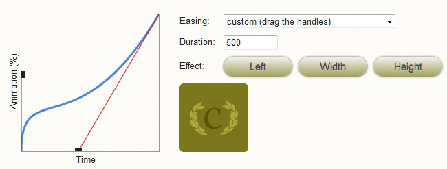
Ceaser - CSS Easing Animation Tool - Matthew Lein
Ceaser – CSS Easing Animation Tool – Matthew Lein

This has been out there for a while, but I just had to post it. This online tool makes it super-easy to create custom CSS3 transition easing settings. Ten seconds on this page and you will be impressed. You can use the drop-down to select a pre-defined easing scheme, and there is a ton of them. Or, you can use the drag-handles to create your own custom settings. To cap things off, you’ve got the handy-dandy little Ceaser logo to demo your code. Crazy. Someone please buy this guy lunch. Nicely done!

http://matthewlein.com/ceaser/


CSS Interview Questions – Margin and Padding

CSS

Before you go into that Front-End Web Developer interview, make sure you’ve got your CSS Margin and Padding facts down.


Q: Which is closer to the content, margin or padding?
A: Padding is closer to the content
Hint: http://www.w3.org/TR/CSS2/box.html


Q: What is the order of the Margin and Padding CSS shorthand syntax?
A: Top, Right, Bottom, Left

Hint: The order is clockwise


Q: How do you set the margin-top and margin-bottom values of a purely inline element?
A: You can’t. Inline elements can only have left and right margins.

Hint: http://stackoverflow.com/questions/1134779/why-do-bottom-padding-and-bottom-margins-not-help-to-add-vertical-spacing-betwee


Q: True or False: Margin and Padding values can be set in percentages.
A: True

Hint: http://stackoverflow.com/questions/4982480/how-to-set-the-margin-or-padding-as-percentage-of-height-or-parent-container


Q: When you see the the following, what is the web developer likely trying to do? margin: 0 auto
A: Center an element

Hint: http://css-tricks.com/snippets/css/centering-a-website/


Q: Which is furthest away from the content: Margin or Border?
A: Margin

Hint: http://www.htmldog.com/guides/cssbeginner/margins/


Q: Can Margin and Padding values be expressed in inches?
A: Yes

Hint: http://www.w3.org/Style/Examples/007/units.en.html


Q: If you wanted more of an element’s background-color to show, which value would you increase, Margin or Padding?
A: Padding. The Margin is outside of the background color.

Hint: http://www.w3.org/TR/CSS2/box.html


Q: Do Margins of inline-block boxes collapse?
A: No

Hint: http://www.w3.org/TR/CSS2/box.html#collapsing-margins


Q: When specifying a margin value as a percentage, what is that number a percentage of?
A: It is calculated with respect to the width of the generated box’s containing block.

Hint: http://www.w3.org/TR/CSS2/box.html#margin-properties

Less CSS – The Absolute Basics

Less CSS

Less CSSLess CSS makes organizing, writing and managing your CSS code a breeze.

Although the CSS 1 specification was completed in 1996, it was not until 2000 that most major browsers fully implemented it. Ever since, we have all come to know and appreciate cascading style sheets. CSS rocks.

But…

The kind of logic that even the most basic programming languages enjoy is still absent from CSS. Granted, CSS is not a programming language, but with the kinds of challenges that today’s web developers face, concepts such as variables, functions and nested logic are difficult to live without in CSS. The end result is a syntax that quickly yields to unnecessary repetition and does not, by nature, allow you to mirror the very DOM you are styling. In addition, your CSS code base can quickly become large and difficult to manage.

Enter Less CSS.

This CSS preprocessor brilliantly allows you to employ the kind of structure and logic found in virtually any programming language. The syntax is easy to understand, it mimics your DOM structure and it allows you to keep your code base clean.

Two Implementation Methods

There are two ways that you can implement Less CSS: client-side or compiled. For the sake of simplicity, we will look at the client-side implementation and cover the compiled approach in a later post. Client-side implementation of Less CSS is not recommended for a large code base. In theory, it is inefficient and can quickly slow your page down. But it is perfect for getting to know Less CSS and for simple testing.

Client-side implementation is achieved in two steps. First, rename your .css file to .less. Also, in the LINK tag, change the “rel” attribute from “stylesheet” to “stylesheet/less”. Second, after your LINK tag that points to your .less file, pull in less.js via a SCRIPT tag. That’s it. Brilliant.

Example # 1

Example # 1 starts out by illustrating one very important point: Less CSS is a superset of CSS. This means that any valid CSS will work just fine in a .less file. In fact, there is no reason why you would not write normal CSS in a .less file. There are certainly situations where it makes perfect sense. For example, if I want all H1 and DIV tags to be 800px wide and have a top/bottom margin of 25px, then it just makes sense to say h1,div{ width:800px; margin:25px auto; }.

Nothin’ wrong with that!

The power of Less CSS really becomes apparent when you have a rule that forks. Once you start to write rules like this in CSS, things become inefficient:

Here we have referred to the “foo” class twice. Example # 1 illustrates how, by nesting our rules, we can refer to .foo only once, but define not only the style of the class, but any H2 elements that are descendants of that class. The same goes for the “bar” class.

Here is a link to a fully-functioning page from Example # 1:

http://sub1.kevinchisholm.com/blog/examples/less-css-example-1.html

Example # 2

In Example # 2, we see the use of the ampersand (“&”). This character is used to indicate the following kind of relationships:

  • div.className
  • p#idName
  • a:hover
  • ul:nth-child()
  • etc…

What’s happening here is that when we don’t use the ampersand, then the nested rule indicates a descendant. So, “div .foo” means “any element with the class foo that is a descendant of any DIV element.” But what if we want to indicate “any DIV element with the foo class?” Then we use the ampersand:

Here is a link to a fully-functioning page from Example # 2:

http://sub1.kevinchisholm.com/blog/examples/less-css-example-2.html

Example # 3

In Example # 3, we introduce two new concepts: variables and mixins.

Less CSS Variables

Variables in Less CSS are indicated by preceding the variable name with the “at” symbol (otherwise known as an ampersat). You then initialize that variable as if you were writing a CSS rule. It is important to note that in Less CSS, variable values cannot change during the life of the page; once you define a variable, the value you have assigned it remains fixed.

Less CSS Mixins

I like to think of Less CSS Mixins as functions. In my opinion, the syntax is similar to a JavaScript function:

In the above Less CSS mixin, the arguments are optional. If you include an argument, you must initialize it. But, you do not have to use the argument inside of the mixin, nor do you have to pass-in the argument when calling the mixin. The mixin simply does whatever you tell it to do (i.e. it returns whatever CSS you define inside of it). The power of the mixin is that you can pass it a value as an argument, and this will override the initialized value.

You’ll also notice the last line inside of the mixin: “//etc…”. This is a Less CSS comment. While you can always use valid CSS comment syntax /* comment */ you can also use the double-slash syntax that is found in JavaScript: “//comment”

Here is a link to a fully-functioning page from Example # 3:

http://sub1.kevinchisholm.com/blog/examples/less-css-example-3.html

Summary

In this article, we covered the absolute basics of Less CSS. We learned what Less CSS is and about simple client-side implementation. We also covered nested rules, variables and mixins. These are the very basics of Less CSS and there is much more to discover and talk about.

Helpful Links for Less CSS basics

http://lesscss.org/

http://en.wikipedia.org/wiki/LESS_(stylesheet_language)

What is the difference between a back end and a front end web programming language?

Web Development

You may have heard the terms “back end” and “front end” with respect to web development languages. Some may find them confusing, but there is not too much mystery to it at all.

In the most basic terms, the moniker says it all: a back language runs on the server and does all its work before the page gets to you. By the time you see the web page, any back end  technology that was used to construct and then serve up the page is no longer involved. Conversely, a front end language operates on the client side. It works in your browser and does not do anything until the page and its associated assets comes over the wire.

Back End Programming Language

An example of a back end language is PHP, which is a scripting language. When a user requests a PHP page, the server parses the PHP code, which in most cases results in dynamically created HTML. A PHP page can simply contain HTML. It is not required to include any scripting code at all, but any code that is in the page will be parsed.  Consequently, the web page viewer never sees one line of PHP code. Assuming that the web server administrator has configured the server correctly, it will surely never show you the actual PHP code.  This is because the web server parses the PHP and then generates the page. This results in HTML. Although, a web developer can use PHP to serve up any other text-related asset. For example: JavaScript, JSON, CSS or XML.

Front End Programming Languages

In web-development, many people often use the terms “front-end” and “client-side” to express the same thing. Specifically, they refer to technology that the end user’s computer executes. That is to say, the browser understands these languages and is thus able to interpret the code.

Consequently, this is the exact opposite of a back-end programming language. Specifically, a web server does not understand HTML, CSS or JavaScript. It simply ensures that files that contain these languages can be downloaded . The web server cannot execute HTML, CSS or JavaScript. (There is an exception with regards to JavaScript, which will be discussed shortly.) But, browsers such as Internet Explorer, FireFox and Chrome do understand these languages, and are able to execute them on the front-end. Accordingly, this means that your computer parses HTML, CSS and JavaScript. In the case of JavaScript,  your computer executes that code.

JavaScript is probably the most commonly used front end web development programing language. Technically, it is a scripting language. Unless you explicitly disable JavaScript in your browser, you see and interact with it every day. When you request a web page, the JavaScript is either in the page, or is downloaded in a separate file. JavaScript runs in your browser, and most people only associate it with those annoying pop-up ads. This was true in the past, but today, JavaScript plays an integral part in creating rich user experiences.

Important Note: Although JavaScript has historically been a 100% front end technology, it is now a fully mature back end language as well. Thanks to the brilliant work and vision of Ryan Dahl, JavaScript can now be run server-side by using Node.js.

Helpful Links for Back End and Front End Languages

Front-End / Client-Side Languages & Technologies

JavaScript

http://en.wikipedia.org/wiki/JavaScript

http://blog.kevinchisholm.com/tag/native-javascript/

https://developer.mozilla.org/en-US/docs/Web/JavaScript

ActionScript

https://en.wikipedia.org/wiki/ActionScript

https://github.com/languages/ActionScript

http://www.adobe.com/devnet/actionscript.html

CSS

http://en.wikipedia.org/wiki/Cascading_Style_Sheets

http://www.w3.org/Style/CSS/Overview.en.html

Kevin Chisholm – Blog – Posts about: CSS

Back-End / Server-Side Languages

PHP

http://www.php.net/

http://en.wikipedia.org/wiki/PHP

http://en.wikibooks.org/wiki/PHP_Programming

http://www.codecademy.com/tracks/php

ASP.NET (C# / VB.NET)

http://www.asp.net/

http://en.wikipedia.org/wiki/ASP.NET

http://msdn.microsoft.com/en-us/library/vstudio/4w3ex9c2(v=vs.100).aspx

ASP.NET Overview

ASP.NET and Visual Studio for Web

Java

http://www.java.com/en/

https://en.wikipedia.org/wiki/Java_(programming_language)

Node.js (Server-Side JavaScript)

http://nodejs.org/

http://en.wikipedia.org/wiki/Nodejs

http://blog.kevinchisholm.com/tag/node-js-2/

http://stackoverflow.com/questions/2353818/how-do-i-get-started-with-node-js