Getting Started With CSS3 Transitions – Part III: Using Cubic-Bezier for More Lifelike Motion

CSS3

CSS3 LogoIn parts I and part II of this series Getting Started With CSS3 Transitions Part I and Getting Started With CSS3 Transitions Part II, we covered the absolute basics of CSS3 transitions. In those articles, we focused on applying transitions to single and multiple properties, and setting delays. In this article, we will review a more complex animation. The example is still pretty basic, but it is the next step with CSS3 transitions. We will discuss how varying the values of different properties can allow for animations that have a more lifelike quality.

IMPORTANT NOTE: In Part I of this series, we used all vendor prefixes needed to ensure cross-browser functionality. Here, for the sake of brevity, we will only include the -webkit- prefix. Please view these examples with a WebKit Browser, or edit the JSFiddle links as needed with -o- and -moz- prefixes.

Here is the markup we’ll need for our example:

Example # 1

In Example # 1, the first four rules are minified for brevity; there’s not too much to see there and it’s not really part of this discussion. It just sets the CSS for the elements in the page.

Notice that for the .foo class, we have specified “-webkit-transition-property”. This allows us to then set the duration and delay for each one of those properties. The end result is that when you mouse-over span.foo, it first grows in height, then it slides down, and then it changes color. We have configured it to behave exactly this way by setting the duration and delay separately for each one of the properties that changes.

When you mouse-over span.bar, things are a bit different. The first difference is that we use the CSS3 transition shorthand syntax so that all properties that can be transitioned are, and they share the duration and easing values. The second difference is that instead of using a named easing such as “linear” or “ease-in”, we use cubic-bezier, and specify the values needed for the required behavior. A deep discussion of cubic-bezier is out of the scope of this article, but at the bottom of this page are a few links that provide more helpful information on that topic.

When you look at the working example (JS Fiddle link), you will see that the behavior of span.foo and span.bar are quite different. Not only does span.foo differ because the properties that transition do so with different durations and delays, but span.bar really “feels” different because we used cubic-bezier to craft a much more real-world type of motion.

Here is the JS Fiddle link for Example # 1: http://jsfiddle.net/tQxxK/

Summary

In this article we learned how to create more complex animations using CSS3 transitions.We discussed how varying the duration and delay of multiple properties can create more life-like motion, and had a brief introduction to the cubic-bezier class.


We discussed how varying the duration and delay of multiple properties can create more life-like motion, and had a brief introduction to the cubic-bezier class.

Helpful Links for the CSS cubic-bezier class

http://www.azarask.in/blog/post/animation-css-transitions-jquery-easy/

http://www.the-art-of-web.com/css/timing-function/#.UTtpadE6WyM

https://developer.mozilla.org/en-US/docs/CSS/timing-function

http://roblaplaca.com/blog/2011/03/11/understanding-css-cubic-bezier/

http://www.roblaplaca.com/examples/bezierBuilder/

http://cubic-bezier.com/#.17,.67,.83,.67

Getting Started With CSS3 Transitions – Part II

CSS3

CSS3 LogoIn the previous article:
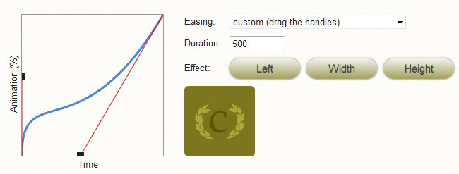
 Getting Started With CSS Transitions – Part I, we covered the very basics of CSS3 transitions. We covered how to apply a transition to the height property of an element, and how to add a duration in order to see the effect of our transition. We also discussed easing, which makes the transition feel more natural.

In this article, we will talk about applying transitions to all of the properties of the declaration that show a change in value, and setting a delay.

IMPORTANT NOTE: In Part I of this series, we used all vendor prefixes needed to ensure cross-browser functionality. For brevity sake, we will only include the -webkit- prefix. Please view these examples with a WebKit Browser, or edit the JSFiddle links as needed with -o- and -moz- prefixes.

Here is the markup we’ll need for all three examples:

Applying CSS3 transitions to all properties of your declaration

Example # 1A

In Example # 1A, we specify “-webkit-transition-property” and provide the value of “height”. So, even though the background color value changes on hover, the transition is only applied to height.

Here is the JS Fiddle link for Example # 1A: http://jsfiddle.net/eQd3n/

Example # 1B

In Example # 1B, we specify “-webkit-transition-property” and use the value: “all”. This means that ALL properties whose value changes on hover have the transition behavior applied (as long as they can be transitioned).

Here is the JS Fiddle link for Example # 1B: http://jsfiddle.net/DVFmd/

Example # 1C

In Example # 1C, we simply leave out “-webkit-transition-property”. By doing this, we achieve the exact same result as Example # 1B: For ALL properties whose values change on hover, the transition behavior is applied (as long as they can be transitioned).

Here is the JS Fiddle link for Example # 1C: http://jsfiddle.net/Hqv3J/

Example # 2

In Example # 2, we achieve the exact same result as Example # 1C, except we accomplish this by using the CSS3 transition shorthand notation, and provide “all” as the first value.

Here is the JS Fiddle link for Example # 2: http://jsfiddle.net/SKzAE/

Applying a delay to your CSS3 transition

Example # 3

In Example # 3, we have provided a fourth value to the CSS3 transition shorthand notation: a delay time. In this example, a value of “0.5s” is used, which forces the transition to wait a half-second before starting.

Here is the JS Fiddle link for Example # 3: http://jsfiddle.net/fsGLL/

Summary

In this article we learned three ways to apply CSS3 transitions to all properties in a declaration that see a change in value (as long as they can be transitioned). We also discussed CSS3 transition shorthand notation, and how to apply a delay to the effect.

Helpful Links for applying CSS3 transitions to multiple properties

http://www.w3.org/TR/css3-transitions/#animatable-properties

http://perishablepress.com/top-5-css-shorthand-properties/#transitions

http://stackoverflow.com/questions/9670075/css-transition-shorthand-with-multiple-properties

Getting Started With CSS3 Transitions – Part I

CSS3

JavaScript LogoThere’s lots to talk about when it comes to cascading style sheets and animation, but for this article, we’ll keep it short and sweet; just the basics you need for getting started with CSS3 transitions.

For the majority of the time we’ve been consuming HTML, making things move on web pages has been handled by JavaScript. At first it was a nightmare. jQuery has nicely abstracted away much of the cross-browser misery for us and I thank them dearly for this. Now, CSS3 provides functionality for animation that allows you to write less JavaScript, and leverage the brilliance of cascading style sheets, to handle your simple (and sometimes not so simple) animation effects.

Here is the markup we’ll need for all three examples:

Put your mouse over me

A Basic Transition

Example # 1

In Example # 1, we have the most basic CSS3 transition possible. On hover, we simply tell the browser to transform the height property from 100px to 300px. The only problem here is that the end result feels very CSS 2.1. Because the change is instant, we don’t really feel the transition effect. In order to do so, we need to specify a duration.

You may have noticed that we are using vendor prefixes. This allows us to make sure that our CSS code will work across browsers. I won’t get into a discussion about vendor prefixes here, but here is a good article about that topic:

http://css-tricks.com/how-to-deal-with-vendor-prefixes/

Here is the JSFiddle link for Example # 1: http://jsfiddle.net/w76ZL/

Specifying the Duration for Your CSS3 Transition

Example # 2

In Example # 2, we have specified a duration of two seconds to our CSS3 transition. This makes a big difference because in the first example, although we had applied a CSS3 transition, the lack of a duration property negated the transition effect. Now that we have added a duration property, the transition effect is much more evident.

Here is the JSFiddle link for Example # 2: http://jsfiddle.net/eAEpC/

Adding Easing to Your CSS Transition

Example # 3

In Example # 3, we added an easing value to our CSS3 transition. Easing is used to make the transition feel more realistic. Some common values are “ease-in”, “ease-out” and “linear”, but there are others.

Here is the JSFiddle link for Example # 3: http://jsfiddle.net/4tcLx/

Summary

In this article we discussed the very basics of CSS3 transitions. We covered how to apply a transition to the height property of an element, and we added a duration so that we can see the effect of our transition. We also discussed easing, which makes the transition feel more natural.

Helpful Links for CSS3 Transitions Basics

http://www.w3.org/TR/css3-transitions/

http://net.tutsplus.com/tutorials/html-css-techniques/css-fundametals-css-3-transitions/

http://www.css3.info/preview/css3-transitions/

http://blogs.msdn.com/b/eternalcoding/archive/2011/11/01/css3-transitions.aspx

Ceaser – CSS Easing Animation Tool by Matthew Lein

CSS3
Ceaser - CSS Easing Animation Tool - Matthew Lein
Ceaser – CSS Easing Animation Tool – Matthew Lein

This has been out there for a while, but I just had to post it. This online tool makes it super-easy to create custom CSS3 transition easing settings. Ten seconds on this page and you will be impressed. You can use the drop-down to select a pre-defined easing scheme, and there is a ton of them. Or, you can use the drag-handles to create your own custom settings. To cap things off, you’ve got the handy-dandy little Ceaser logo to demo your code. Crazy. Someone please buy this guy lunch. Nicely done!

http://matthewlein.com/ceaser/