Getting Started With CSS3 Transitions – Part I

CSS3

JavaScript LogoThere’s lots to talk about when it comes to cascading style sheets and animation, but for this article, we’ll keep it short and sweet; just the basics you need for getting started with CSS3 transitions.

For the majority of the time we’ve been consuming HTML, making things move on web pages has been handled by JavaScript. At first it was a nightmare. jQuery has nicely abstracted away much of the cross-browser misery for us and I thank them dearly for this. Now, CSS3 provides functionality for animation that allows you to write less JavaScript, and leverage the brilliance of cascading style sheets, to handle your simple (and sometimes not so simple) animation effects.

Here is the markup we’ll need for all three examples:

Put your mouse over me

A Basic Transition

Example # 1

In Example # 1, we have the most basic CSS3 transition possible. On hover, we simply tell the browser to transform the height property from 100px to 300px. The only problem here is that the end result feels very CSS 2.1. Because the change is instant, we don’t really feel the transition effect. In order to do so, we need to specify a duration.

You may have noticed that we are using vendor prefixes. This allows us to make sure that our CSS code will work across browsers. I won’t get into a discussion about vendor prefixes here, but here is a good article about that topic:

http://css-tricks.com/how-to-deal-with-vendor-prefixes/

Here is the JSFiddle link for Example # 1: http://jsfiddle.net/w76ZL/

Specifying the Duration for Your CSS3 Transition

Example # 2

In Example # 2, we have specified a duration of two seconds to our CSS3 transition. This makes a big difference because in the first example, although we had applied a CSS3 transition, the lack of a duration property negated the transition effect. Now that we have added a duration property, the transition effect is much more evident.

Here is the JSFiddle link for Example # 2: http://jsfiddle.net/eAEpC/

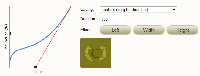
Adding Easing to Your CSS Transition

Example # 3

In Example # 3, we added an easing value to our CSS3 transition. Easing is used to make the transition feel more realistic. Some common values are “ease-in”, “ease-out” and “linear”, but there are others.

Here is the JSFiddle link for Example # 3: http://jsfiddle.net/4tcLx/

Summary

In this article we discussed the very basics of CSS3 transitions. We covered how to apply a transition to the height property of an element, and we added a duration so that we can see the effect of our transition. We also discussed easing, which makes the transition feel more natural.

Helpful Links for CSS3 Transitions Basics

http://www.w3.org/TR/css3-transitions/

http://net.tutsplus.com/tutorials/html-css-techniques/css-fundametals-css-3-transitions/

http://www.css3.info/preview/css3-transitions/

http://blogs.msdn.com/b/eternalcoding/archive/2011/11/01/css3-transitions.aspx

Ceaser – CSS Easing Animation Tool by Matthew Lein

CSS3
Ceaser - CSS Easing Animation Tool - Matthew Lein
Ceaser – CSS Easing Animation Tool – Matthew Lein

This has been out there for a while, but I just had to post it. This online tool makes it super-easy to create custom CSS3 transition easing settings. Ten seconds on this page and you will be impressed. You can use the drop-down to select a pre-defined easing scheme, and there is a ton of them. Or, you can use the drag-handles to create your own custom settings. To cap things off, you’ve got the handy-dandy little Ceaser logo to demo your code. Crazy. Someone please buy this guy lunch. Nicely done!

http://matthewlein.com/ceaser/


CSS Interview Questions – Margin and Padding

CSS

Before you go into that Front-End Web Developer interview, make sure you’ve got your CSS Margin and Padding facts down.


Q: Which is closer to the content, margin or padding?
A: Padding is closer to the content
Hint: http://www.w3.org/TR/CSS2/box.html


Q: What is the order of the Margin and Padding CSS shorthand syntax?
A: Top, Right, Bottom, Left

Hint: The order is clockwise


Q: How do you set the margin-top and margin-bottom values of a purely inline element?
A: You can’t. Inline elements can only have left and right margins.

Hint: http://stackoverflow.com/questions/1134779/why-do-bottom-padding-and-bottom-margins-not-help-to-add-vertical-spacing-betwee


Q: True or False: Margin and Padding values can be set in percentages.
A: True

Hint: http://stackoverflow.com/questions/4982480/how-to-set-the-margin-or-padding-as-percentage-of-height-or-parent-container


Q: When you see the the following, what is the web developer likely trying to do? margin: 0 auto
A: Center an element

Hint: http://css-tricks.com/snippets/css/centering-a-website/


Q: Which is furthest away from the content: Margin or Border?
A: Margin

Hint: http://www.htmldog.com/guides/cssbeginner/margins/


Q: Can Margin and Padding values be expressed in inches?
A: Yes

Hint: http://www.w3.org/Style/Examples/007/units.en.html


Q: If you wanted more of an element’s background-color to show, which value would you increase, Margin or Padding?
A: Padding. The Margin is outside of the background color.

Hint: http://www.w3.org/TR/CSS2/box.html


Q: Do Margins of inline-block boxes collapse?
A: No

Hint: http://www.w3.org/TR/CSS2/box.html#collapsing-margins


Q: When specifying a margin value as a percentage, what is that number a percentage of?
A: It is calculated with respect to the width of the generated box’s containing block.

Hint: http://www.w3.org/TR/CSS2/box.html#margin-properties

Less CSS – The Absolute Basics

Less CSS

Less CSSLess CSS makes organizing, writing and managing your CSS code a breeze.

Although the CSS 1 specification was completed in 1996, it was not until 2000 that most major browsers fully implemented it. Ever since, we have all come to know and appreciate cascading style sheets. CSS rocks.

But…

The kind of logic that even the most basic programming languages enjoy is still absent from CSS. Granted, CSS is not a programming language, but with the kinds of challenges that today’s web developers face, concepts such as variables, functions and nested logic are difficult to live without in CSS. The end result is a syntax that quickly yields to unnecessary repetition and does not, by nature, allow you to mirror the very DOM you are styling. In addition, your CSS code base can quickly become large and difficult to manage.

Enter Less CSS.

This CSS preprocessor brilliantly allows you to employ the kind of structure and logic found in virtually any programming language. The syntax is easy to understand, it mimics your DOM structure and it allows you to keep your code base clean.

Two Implementation Methods

There are two ways that you can implement Less CSS: client-side or compiled. For the sake of simplicity, we will look at the client-side implementation and cover the compiled approach in a later post. Client-side implementation of Less CSS is not recommended for a large code base. In theory, it is inefficient and can quickly slow your page down. But it is perfect for getting to know Less CSS and for simple testing.

Client-side implementation is achieved in two steps. First, rename your .css file to .less. Also, in the LINK tag, change the “rel” attribute from “stylesheet” to “stylesheet/less”. Second, after your LINK tag that points to your .less file, pull in less.js via a SCRIPT tag. That’s it. Brilliant.

Example # 1

Example # 1 starts out by illustrating one very important point: Less CSS is a superset of CSS. This means that any valid CSS will work just fine in a .less file. In fact, there is no reason why you would not write normal CSS in a .less file. There are certainly situations where it makes perfect sense. For example, if I want all H1 and DIV tags to be 800px wide and have a top/bottom margin of 25px, then it just makes sense to say h1,div{ width:800px; margin:25px auto; }.

Nothin’ wrong with that!

The power of Less CSS really becomes apparent when you have a rule that forks. Once you start to write rules like this in CSS, things become inefficient:

Here we have referred to the “foo” class twice. Example # 1 illustrates how, by nesting our rules, we can refer to .foo only once, but define not only the style of the class, but any H2 elements that are descendants of that class. The same goes for the “bar” class.

Here is a link to a fully-functioning page from Example # 1:

http://sub1.kevinchisholm.com/blog/examples/less-css-example-1.html

Example # 2

In Example # 2, we see the use of the ampersand (“&”). This character is used to indicate the following kind of relationships:

  • div.className
  • p#idName
  • a:hover
  • ul:nth-child()
  • etc…

What’s happening here is that when we don’t use the ampersand, then the nested rule indicates a descendant. So, “div .foo” means “any element with the class foo that is a descendant of any DIV element.” But what if we want to indicate “any DIV element with the foo class?” Then we use the ampersand:

Here is a link to a fully-functioning page from Example # 2:

http://sub1.kevinchisholm.com/blog/examples/less-css-example-2.html

Example # 3

In Example # 3, we introduce two new concepts: variables and mixins.

Less CSS Variables

Variables in Less CSS are indicated by preceding the variable name with the “at” symbol (otherwise known as an ampersat). You then initialize that variable as if you were writing a CSS rule. It is important to note that in Less CSS, variable values cannot change during the life of the page; once you define a variable, the value you have assigned it remains fixed.

Less CSS Mixins

I like to think of Less CSS Mixins as functions. In my opinion, the syntax is similar to a JavaScript function:

In the above Less CSS mixin, the arguments are optional. If you include an argument, you must initialize it. But, you do not have to use the argument inside of the mixin, nor do you have to pass-in the argument when calling the mixin. The mixin simply does whatever you tell it to do (i.e. it returns whatever CSS you define inside of it). The power of the mixin is that you can pass it a value as an argument, and this will override the initialized value.

You’ll also notice the last line inside of the mixin: “//etc…”. This is a Less CSS comment. While you can always use valid CSS comment syntax /* comment */ you can also use the double-slash syntax that is found in JavaScript: “//comment”

Here is a link to a fully-functioning page from Example # 3:

http://sub1.kevinchisholm.com/blog/examples/less-css-example-3.html

Summary

In this article, we covered the absolute basics of Less CSS. We learned what Less CSS is and about simple client-side implementation. We also covered nested rules, variables and mixins. These are the very basics of Less CSS and there is much more to discover and talk about.

Helpful Links for Less CSS basics

http://lesscss.org/

http://en.wikipedia.org/wiki/LESS_(stylesheet_language)

CSS Absolute Positioning – The Absolute Basics

CSS

JavaScript LogoAbsolute positioning is one of the four types of CSS “position” values

When an element is given absolute positioning, the following behavior takes place: 1 – The element is positioned in the top-left-most corner of the nearest parent element that has positioning (this is the default), 2 – If no parent elements have positioning, then the element is positioned in the top-left-most corner of the browser window and 3 – You can use the “top”,”left”,”bottom” and “right” properties to place the element absolutely as you need.

Example # 1

In Example # 1, we have set up three container DIVs. If you look at the class names, you’ll see that there is an outermost DIV: “grand-parent”, an inner DIV: “parent” and an innermost DIV: “child”. When you look at the jsFiddle.net example, there is simply a big yellow box (the grand-parent), a smaller red box inside of the yellow box (the parent), and a small green box inside of the red box (the child).

I’ve set the height property for each element so that we don’t need to concern ourselves with any text nodes; so it’s just three empty DIVs, which look like a box, within a box, within a box.

Here is the jsFiddle.net link for Example # 1: http://jsfiddle.net/tK8hH/

Example # 2

An absolutely positioned element will be positioned relative to the nearest parent with positioning.

In Example # 2, we gave the “child” DIV absolute positioning, and set the bottom and right properties to 0. When you look at the jsFiddle.net link, the green box is in the bottom-right-hand corner of the screen. The reason for this is that an absolutely positioned element will be positioned relative to the nearest parent with positioning (i.e. “absolute”, “relative” or “fixed”). If no parent (i.e. containing) elements up the DOM have positioning, then the element will be positioned relative to the browser window. So, in this case, the green box is positioned absolutely, relative to the browser window. Because the “bottom” and “right” properties are both set to “0”, the green box appears in the bottom-right corner. If you change it to “top:0;”, then the green box will appear in the TOP-right corner of the browser window.

Here is the jsFiddle.net link for Example # 2: http://jsfiddle.net/7U8cN/

Example # 3

In Example # 3, we gave the “parent” element relative positioning. This has no visual effect on the “parent” element, but it does change things quite a bit for the green “child” DIV. Because the “parent” now has positioning, the green “child” DIV appears in the lower-right-hand corner of the red “parent” DIV. This is because it is now positioned absolutely, relative to the red “parent” DIV. Here is the jsFiddle.net link for Example # 3: http://jsfiddle.net/4KUWc/

Example # 4

In Example # 4, we have changed the red “parent” DIV’s positioning to “absolute” and given the yellow “grand-parent” DIV “relative” positioning. So let’s run down what is happening here:

  • The red “parent” DIV is positioned absolutely, 300px to the right, and 50px from the top of the yellow “grand-parent” DIV
  • The green “child” DIV is positioned absolutely, -50px from the bottom, and -50px from the right of the red “parent” DIV.

If you look at the jsFiddle.net link for Example # 4, you’ll see that the red box is now sticking outside of the right side of the yellow “grand-parent” DIV, and the green “child” DIV is sticking outside of the red “parent” DIV, 50px to the right, and 50px towards the bottom.

Here is the jsFiddle.net link for Example # 4:

Summary

CSS Absolute Positioning is quite a useful tool when it comes to nudging elements to exactly where you want them to be. So the key to mastering absolute positioning in CSS is to remember two rules:

  1. An absolutely positioned element will be positioned relative to the nearest parent or ancestor element that is positioned relative or absolute
  2. If there are no positioned parents, the element will be positioned absolutely, relative to the browser window

How to Create a CSS Cache Buster Using JavaScript

JavaScript

JavaScript LogoUse the Date() constructor to create a unique query string; ensure each GET request is not cached

The other day, I was working with a customer whose iPad app was consuming an HTML page.
I was making changes to the CSS, yet was not seeing them in the iPad app. I kept adding a new query string to the URL of the CSS file, which forced the iPad app to download the updated CSS file. So, growing a little tired of changing the URL to the CSS element, I wrote a little cache buster script, and that was the end of the fiddling around.

This is very easy to do, so let’s look at an example.

Example # 1

In this example, we instantiate the Date() constructor, and get a reference to the time. Since this number is incremented by one, it will always be unique. We then create a new element, and set the required attributes: “rel”, “type” and “href”. The href has a query string that includes a reference to the time, so we have a GET request that is essentially different from the last one we made, and the next one we make will be different from this one, and so on.

Run this in your JavaScript console, and as long as you have a file name “style.css” in the same directory as your HTML file, you will see a new element appended to the <head> element. You can, of course, take the same approach with any resource that requires a web address such as a JavaScript file, an image, and so on.

Summary
Cache busting can ensure that often-changing files such as CSS and JavaScript always get downloaded by the client’s browser (i.e. never cached). It’s just a simple technique, but it can keep you from pulling your hair out.

Helpful Links for the subjet of cache busting

http://html5boilerplate.com/docs/Version-Control-with-Cachebusting/

http://www.adopsinsider.com/ad-ops-basics/what-is-a-cache-buster-and-how-does-it-work/

http://twosixcode.com/notes/view/simple-cache-busting-for-css-and-js