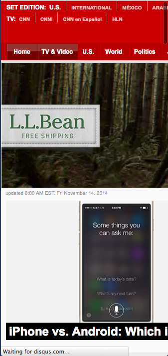
Resizing your browser down to 320px doesn’t always do the trick. If you prefer to develop in FireFox, but need to emulate a mobile experience, the Modify Headers add-on is very helpful
This past week, I’ve been developing an optimizely experiment for a new client. This has been one of the more ambitious experiments I’ve developed. It requires not only a complex reworking of an existing slideshow, but back-end reporting on the user’s choices, form submission and exit point as well. But the most significant challenge has been the fact that there is no dedicated mobile URL for this site. Device detection is done on the back-end, and then either the desktop or mobile version of the page is served.

There were a few obvious options that first came to mind. I knew I could leverage Safari to view the page on my iPhone and yet have complete control of the DOM via the JavaScript console. But that is mainly useful for previewing my work and interacting with the DOM through the console. Given the amount of work ahead of me, I preferred to work in a desktop browser. Also, Google Chrome’s Device Mode Mobile Emulation is awesome, especially for testing mobile-specific gestures. But I still prefer to do my front-end development in FireFox. The main reason for this is that even though FireFox has become possibly the slowest browser and always feels painfully sluggish, I still prefer FireBug over Chrome’s built-in developer tools. I cannot stress enough, how outstanding Chrome’s developer tools are, and how much they are improving every day. But when it comes to the first 90% of the general development grunt-work, FireBug’s CSS panel and JavaScript console just always feel more natural to me.

Coincidentally, I also just checked out FireFox Developer Edition. Now while it clearly had some pretty cool features, I wasn’t getting what I needed quickly (and to be fair, this may be purely due to my inexperience with the new FireFox developer edition).
Nearly exasperated, I thought to myself: “Wait a minute, there has to be a plugin that lets me spoof the headers…” After about 7 seconds with Google search, I came across Modify Headers 0.7.1.1 by Gareth Hunt. Problem solved. In less than five minutes, I had successfully forced the site to serve-up it’s mobile version in my desktop’s FireFox browser. I quickly re-sized the browser down to 320px (or as close as FF would allow me to get to that). I then set my FireBug location to “detached”, and set these two windows side-by-side.
The Modify Headers add-on is simple and easy to use. By default, it appears in a new window, but can also be set to appear in a new tab via the options pane. You can add new headers or override existing ones (e.g. Accept, User-Agent, Cache-Control, etc.). Without the use of a manual, it is easy to figure out how to save and edit headers, as well as change their order. What I liked most about this add-on is that the features are few, it’s easy to configure, and it just works.
Summary
There are multiple options when it comes to emulating a mobile device in a desktop browser. Safari’s user-agent spoofing is quite helpful, Google Chrome’s Device Mode Mobile Emulation Emulation feature is simply outstanding, and FireFox Developer Edition shows great promise. Choosing the right tool depends on your needs. I prefer to do as much of my front-end grunt-work as possible in FireFox because I still work faster when using FireBug. But many prefer Google Webmaster Tools. Because of my preference for FireBug, I found Gareth Hunt’s Modify Headers 0.7.1.1 to be the tool that solved my problem. If you also prefer to work in FireFox, then I recommend this add-on. If FireFox is not your development browser of choice, then I hope you will find some of the below links helpful.
Helpful Links for mobile development in a desktop browser
Modify Headers 0.7.1.1
https://addons.mozilla.org/en-US/firefox/addon/modify-headers
http://www.garethhunt.com/modifyheaders/
Device Mode Mobile Emulation – Google Chrome
- https://developer.chrome.com/devtools/docs/device-mode
- http://www.realeyes.com/blog/2014/02/19/a-quick-guide-to-chromes-new-built-in-device-emulation/
- http://www.sitepoint.com/use-mobile-emulation-mode-chrome/
Using Safari for iPhone, iPad and iPod Touch Website Testing
http://www.htmlgoodies.com/beyond/webmaster/toolbox/article.php/3889011/Using-Safari-for-iPhone-iPad-and-iPod-Touch-Website-Testing.htm
FireFox Developer Edition

[…] Speaking of modern debugging techniques, my good friend Kevin Chisholm, who regularly writes great tutorials on modern web development techniques, has another great piece about using Firefox’s emulator. […]